Building and Designing Forms
Once you’ve completed your form settings, you can start building and designing your form.
Watch a walkthrough video of building and designing a form, or reference any step below.
- Field types
- Adding fields
- Field settings
- Resizing field width
- Editing fields
- Re-ording fields
- Deleting fields
Building a form: Video Walk-through
Field Types
What type of field will your form require? Having an understanding of each available field will help answer this question:
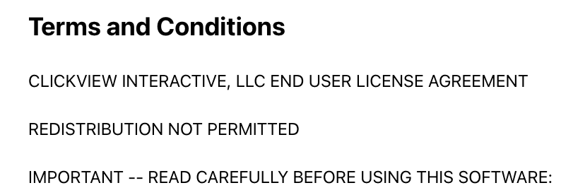
Text Block (form design)
Text Block is used for designing your form, adding textual content such as terms of service, form instructions, and form titles. This is not used for customer data input. You can include as many Text Blocks as you like, and your form will often have multiple Text Blocks included to guide the customer through the form, list all waiver agreements, and add titles to the form.
The title for this field will not be visible to clients.
Example Text Block:
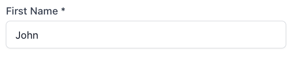
Short text input
Use this field for asking for small bits of text such as names, addresses, values, and more. Customers have one line of text to answer the question.
Example short text input:
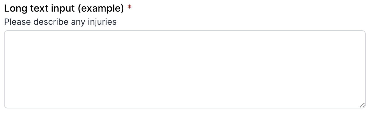
Long text input
Use this field when requesting long textual answers from customers, such as illness or injury descriptions, current fitness routines, comments and feedback etc. Customers will have a large text area providing multiple lines of text to answer the question.
Example long text input:
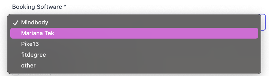
Dropdown Selection
All of your field options in one dropdown menu. Clients can only select one option from the dropdown menu. This is a useful alternative to “Multiple Choice” where you only want one question response, and a field that is small and compact.
If you set this field as required, a client must select at least one option before submitting.
Example Dropdown Selection:
Checkbox
Single checkbox providing only one option. If field is marked as required, a customer must check the box in order to complete your form. This is helpful for waivers or anywhere that a customer must agree to your terms of service before submitting a completed form.
If you set this field as required, a client must click the checkbox before submitting.
Example Checkbox:

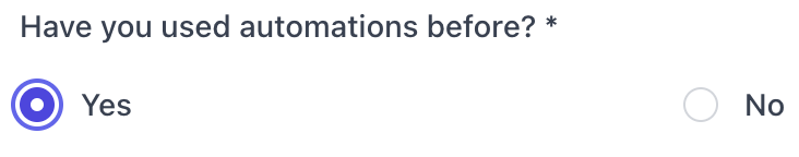
Radio Button
Allow clients to choose ONLY ONE of a predefined set of mutually exclusive options. Use radio buttons for limiting clients to only one option like “yes or no,” gender selection, or rating their most recent class experience.
Example Radio Button:
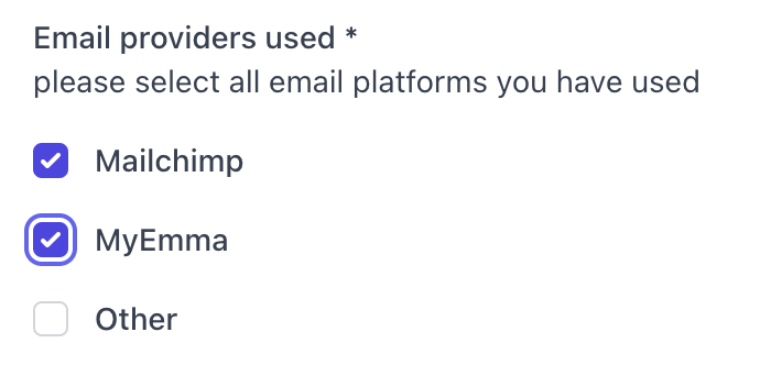
Multiple Choice
Multiple Choice input field lets you list options and have users select one or multiple options.
If you set this field as required, a client must select at least one option before submitting.
Example Multiple Choice:
Signature Field
Add a signature field to your form. This is usually added to waivers to confirm the client's signature before submitting. When added to a form, the signature field will default to required unless you mark it as optional.
By decreasing the width of the signature field, this can also be used to require client initials throughout your form.
Example Signature Field:

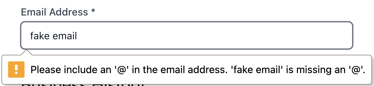
Email Address Input Field
Simple text field that validates the customer's response is valid email address formatting. Customers must input a response that is a valid email format in order to complete this field.
Example Email Address Input Field:
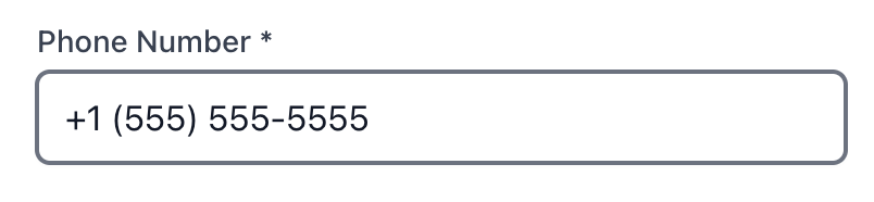
Phone Input Field
A text field that validates the customer's response is a valid phone number formatting. Customers must input a response that is a valid phone number format in order to complete this field.
Example phone Input Field:
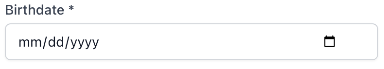
Date Input Field
Need to ask for a specific date or time, perhaps to schedule an event, capture a birthday, or log an activity? The date field is what you’re looking for. Different than a short text input field, the date field requires a valid date be entered.
Example Date Input Field:
Image
Add an image to your form. This can be used to add your business logo to the top of your form, or images throughout your form content.
The Title will not be visible to your clients. Use a descriptive name to identify this content.
Your image will be automatically resized to a maximum height of 320px, and the width will be adjusted to maintain the aspect ratio.
Image Requirements:
- 1MB max upload
- File Formats: PNG, JPG, GIF
- Dark logo that will stand out on white background (recommended)
- Aspect ratio of 4:1 (recommended)
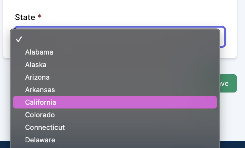
US State Selection
Use our pre-populated dropdown menu containing all US States to request a client’s state address. The state selection dropdown menu allows a standardization of how clients enter their state address (abbreviation vs spelled out).
Example US State Selection Field:
Adding Fields
Below your form settings you will see two boxes:
- Form Content - found on the left
- Form Preview - found to the right of Form Content
Within the Form Content box:
- Click the button + Add new field, a dialog box will appear from the right side of your screen displaying the field types.
- Click on a field to complete the required field settings and add to your form.
Field Settings
After clicking on a field type, a dialog box will appear with required field settings. Different fields will require different field settings. The primary field settings are below:
Title

Title is required for all fields, and each field requires a unique title. If you have more than one field with similar purposes such as requesting the client’s email address, and address of their emergency contact, these titles will need to be unique, example: email address and emergency contact email address.
The title will be visible to your client directly above the field, with the exception of fields: Text Block, Signature, and Image. Titles for these 3 fields will not be visible.
Description

Field description is not required, but if added it will be visible to clients. This optional setting may be useful for adding further instructions for how a client should answer a field.
Optional

By default, all fields will be marked as required. By clicking the optional toggle until it’s green, you can make a field optional.
Prefill
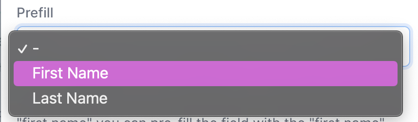
Fields such as Short text input and Email Address Input Field
will have an additional field for prefill. If selected, you select the field to be pre-populated with information already collected from the client, such as first name , last name or email address.
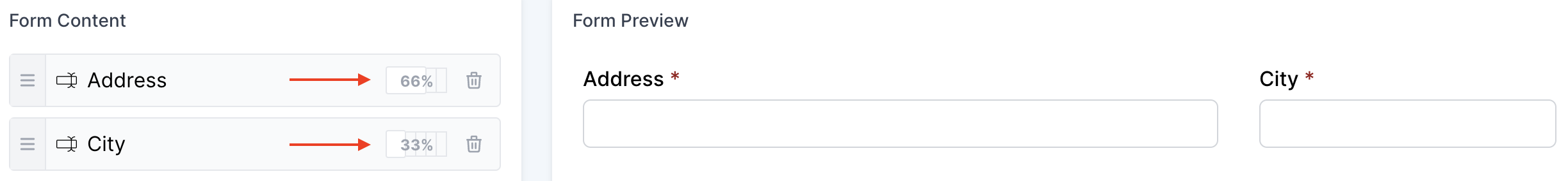
Resizing field width
By default, a field will consume 100% width of the row. You can change the column width of your fields to allow more than one field to exist on the same row.
By decreasing a field below 100%, you can add room for another field or fields so long as those field widths do not exceed 100%
Field Width Options:
- 25%
- 33%
- 50%
- 66%
- 100%
To change a field’s width, click on the width% located on the right side of the field title in the form content box.
Example fields with 66% and 33% width in same row:
Editing fields
To edit a field, click on the field name within the content box. The field dialog box will appear from the right side of your screen, allowing you to edit the form field. Keep in mind the form content cannot be edited after the form has received any submissions.
Re-ording fields
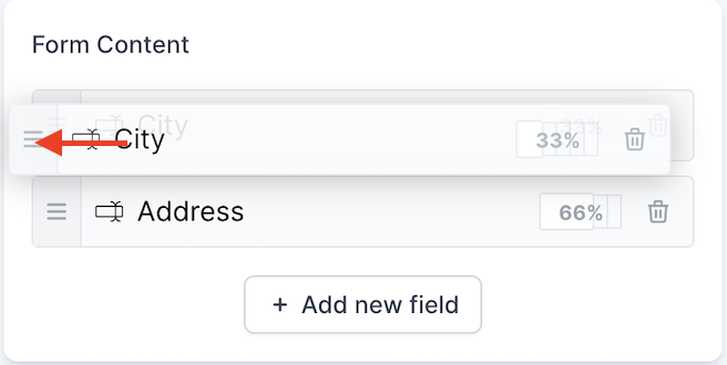
You can change the order of your form fields by clicking on the 3 lines located to the left of your field title and dragging the field to a new position.
Deleting fields
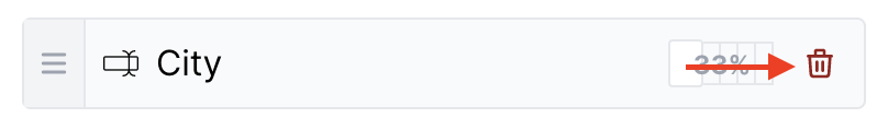
Fields can be deleted by clicking on the trashcan icon located on the right side of your field title.